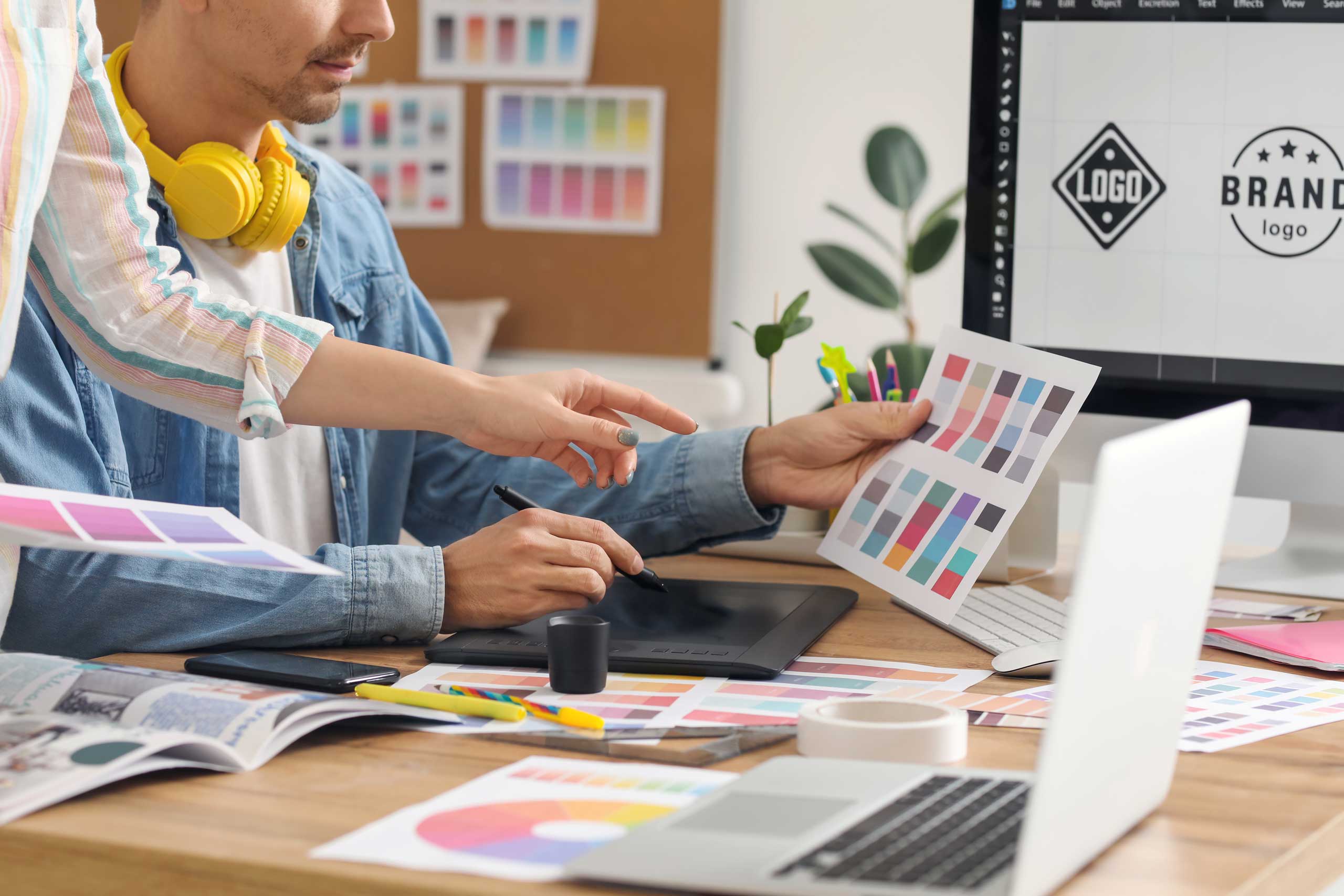
Having a logo designed sounds simple. Send a brief, get three options, pick one, done. But if it were that easy, half of all startups wouldn't be replacing their logo again after two years. A good logo isn't decoration. It's the most compact translation of your brand — and that takes more than a nice shape.
What makes a good logo?
Recognisability over beauty
A logo doesn't have to be "beautiful" in the classic sense. It has to be recognisable. Think of the Nike swoosh or the Apple apple — not necessarily complicated, but unmistakable. Simplicity beats complexity, almost always.
Scalability
Your logo has to work on a business card and on a building facade. On a 16×16 pixel website favicon and on a three-metre-wide exhibition stand. If it only works at one size, it isn't a good logo — it's an illustration.
Timelessness vs. trends
Gradients, 3D effects, ultra-thin lines — every era has its trends. The problem: trends are by definition temporary. A logo that feels hyper-modern now looks dated in five years. Choose character over fashion.
Context and applicability
Does your logo work on a dark background? In black and white? On fabric? In neon? A professional logo is delivered in multiple variants — full colour, monochrome, horizontal, vertical — so it works everywhere.
The process: from brief to delivery
Step 1: The brief
A good brief is half the work. What does your business do? Who is your audience? What are your values? Which brands do you admire — and which not? The more concrete the input, the sharper the result.
Step 2: Research and positioning
Before a single sketch is made, a good agency looks at your market, your competitors and your positioning. Not to copy, but to know where you can stand out.
Step 3: Concept development
Not three random options, but reasoned directions. Each concept tells a different story about your brand. The choice isn't "which do you like most?" but "which best fits who you are?"
Step 4: Refinement and variants
The chosen concept is worked out in all the variants you need. Full colour, monochrome, with and without tagline, horizontal and vertical. Plus guidelines for use — so nobody starts distorting your logo in a PowerPoint.
Step 5: Delivery
All files in the formats you need: vector (AI, EPS, SVG), raster (PNG, JPG) and, where relevant, specific formats for social media or print. Source files included.
Red flags when choosing a designer
"Choose from 100+ logo options"
If someone gives you a hundred options, nobody thought about it. Quantity isn't quality. Three well-reasoned directions say more than a folder full of variants.
No questions, straight to a concept
A designer who starts right away without asking questions isn't efficient — they're lazy. Without a brief and research, every logo is a shot in the dark.
No source files
If you don't get vector files, you depend on that one designer for every future change. Source files aren't optional — they're part of the deal.
Extremely low prices
A €50 logo isn't an investment, it's a gamble. The chance you'll be happy with it longer than a year is small. And the chance it's legally watertight, smaller still.